2026-05-30
The Dashboard I Said I Wouldn't Build
Adding overview stats, risk trends, and per-repo analytics to PR Risk Scorer.
Two days ago I shipped PR Risk Scorer with a deliberate constraint: no dashboard. Just a bot comment on every pull request.
That was the right call for v0. Install the app, open a PR, get a score. Done.
Then I installed it on my own repo and realized something: individual PR comments are useful, but teams need the bigger picture. How many risky PRs slipped through this month? Which repo is the noisiest? Is Friday still the danger zone?
So I built the dashboard anyway.
Overview: the numbers that matter
The home screen answers four questions at a glance:
- Total PRs analyzed — how much traffic the app is actually seeing
- High risk caught — the PRs that would have needed a second look
- Medium and low risk — the healthy baseline vs. the outliers
- Recent PRs — a live feed with score, author, and time
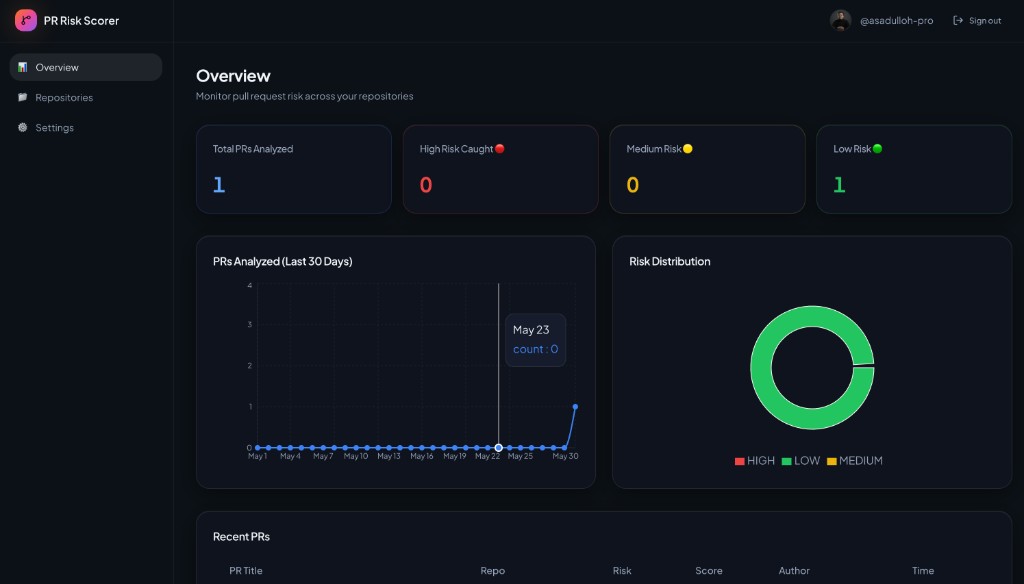
The first PR on my own site scored 20/100 — low risk. The bot flagged content/blog/first-build-log.mdx as the riskiest file. Meta, but accurate: it was the largest content change in the diff.
Risk trends over 30 days
A single score on one PR is a snapshot. A chart over 30 days is a pattern.
The line chart shows PR volume day by day. Right now mine is mostly flat — one spike on the day I shipped — but that is exactly the shape I wanted to see early: flat baseline, visible spikes when something actually ships.
The donut chart next to it splits risk distribution: high, medium, low. When a team has been running the app for a month, this becomes the slide for a retro. "We caught 3 high-risk PRs before merge" is a number engineering managers actually care about.
Per-repo statistics
Most teams do not have one repo. They have a monorepo, a frontend, a backend, and three microservices nobody wants to touch.
The Repositories page shows stats per connected repo:
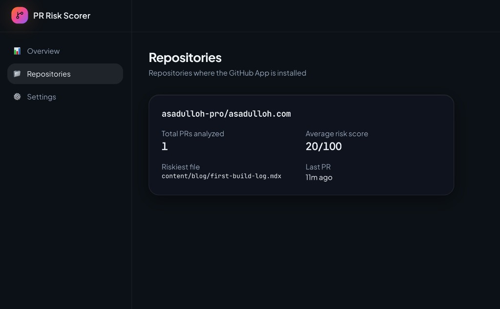
For each repo you get:
- Total PRs analyzed
- Average risk score — is this repo consistently calm or consistently spicy?
- Riskiest file — where does risk concentrate?
- Last PR — when did the app last run?
My site repo: 1 PR, average score 20/100, last activity 11 minutes ago. Small sample, but the layout scales.
What changed from the MVP
| v0 (bot only) | v0.5 (dashboard) | | --- | --- | | Score on each PR | Aggregate stats across all PRs | | No history | 30-day trend chart | | No repo view | Per-repo breakdown | | Comment is the product | Comment + dashboard |
I did not add custom rules, Slack alerts, or paid plans. The scope stayed tight: store what the bot already computes, then surface it.
Stack notes
Same core as before — Next.js, TypeScript, Tailwind on the frontend. The bot writes scores to the database on every PR event; the dashboard reads from that same table. No duplicate logic, no second source of truth.
Auth is GitHub OAuth. You sign in with the account that installed the app and see only your repos.
Honest numbers
| Metric | Value | | --- | --- | | PRs analyzed (my repos) | 1 | | High risk caught | 0 | | Time to add dashboard | ~1 day | | MRR | still $0 |
What's next
- Email digest when a high-risk PR lands
- Team view — share dashboard access without sharing GitHub admin
- Repo baselines so a score of 40 means something different in a calm repo vs. a hot one
The bot still does the work on every PR. The dashboard just makes that work visible over time.
Try the beta — install on a repo, open a PR, then check the overview.